Work in Progress – Read This First
This project is still a work in progress and not the final result. While the visual identity is mostly finished, some of the layout and text are still missing or unfinished and are still being developed.
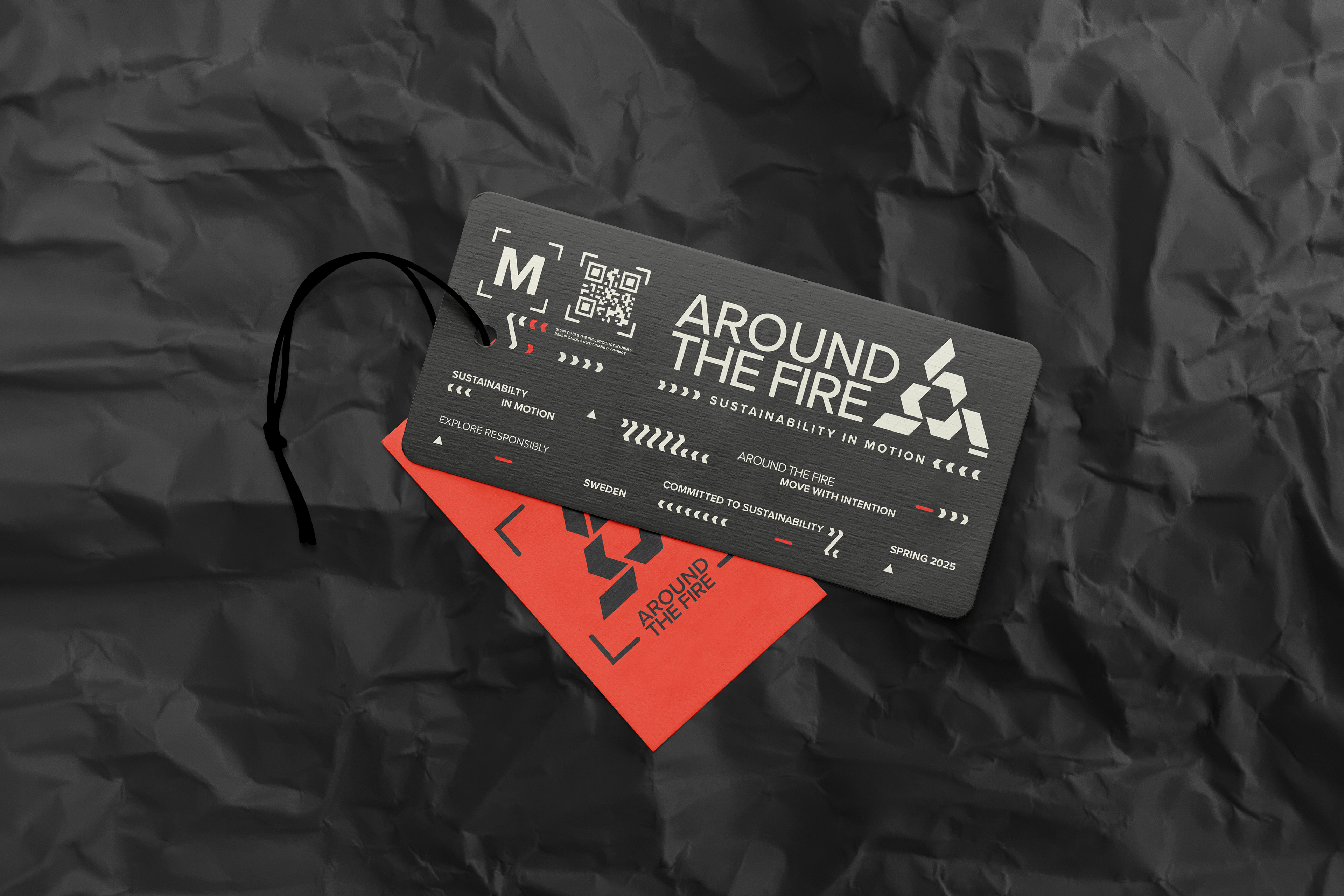
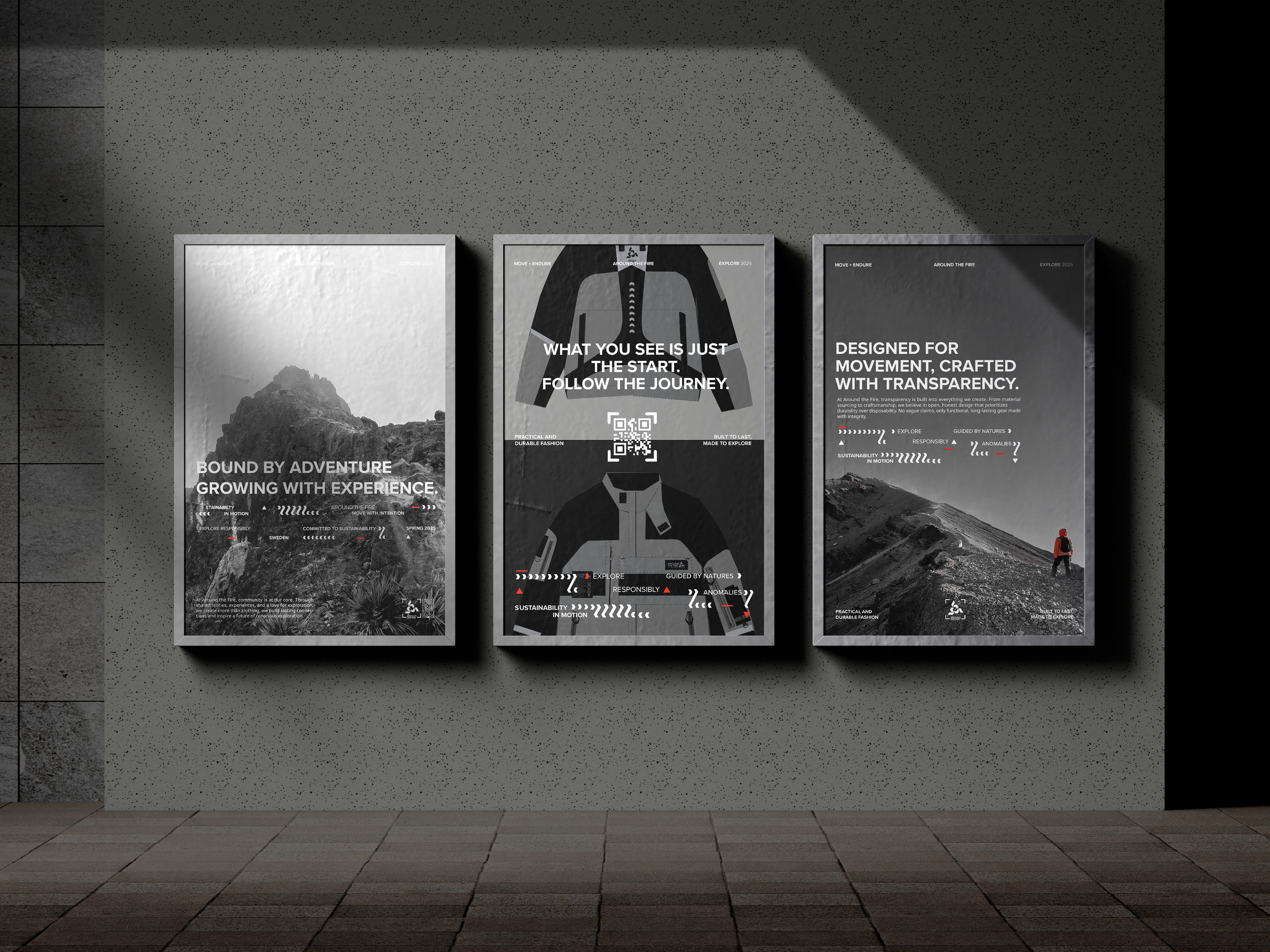
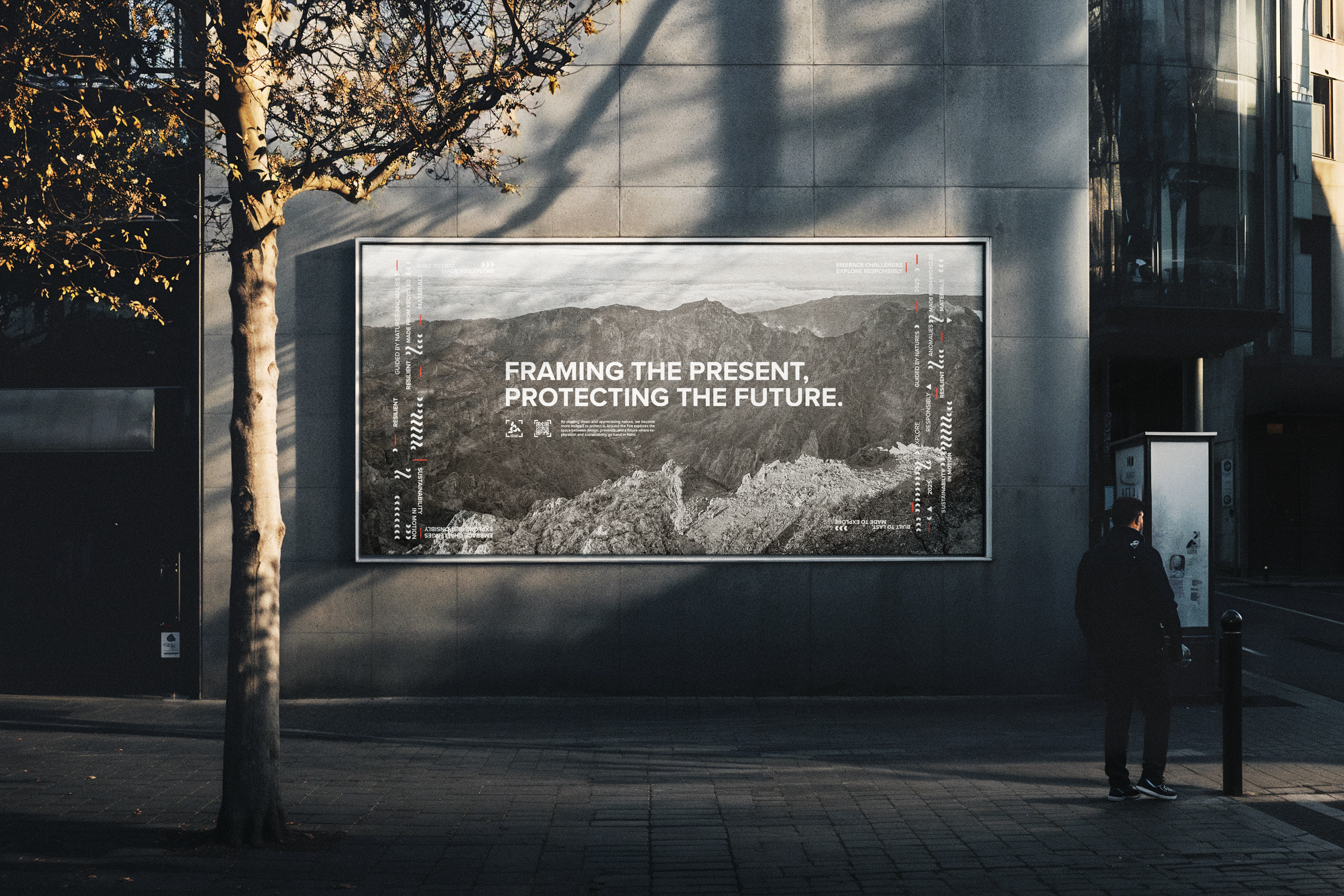
With that said, please take a look at the images showcasing the logotype, products, marketing posters, and website screenshots. Illustrations and visual assets were made in Illustrator, the posters in Photoshop, and the website in Figma.
This is part of my bachelor thesis, combining branding and product design for Around the Fire—a fictional sustainable fashion brand exploring storytelling, functionality, and conscious consumption.
Around the Fire - Sustainability in Motion
Around the Fire is a speculative brand and design project developed to craft a visual and verbal identity that embodies the values of exploration, connection, and transformation. Positioned at the intersection of outdoor ruggedness and techwear aesthetics, the brand reflects a forward-thinking mindset grounded in transparency, sustainability, and storytelling.
The project aims to inspire a shift in how we engage with clothing — moving away from fast fashion toward more thoughtful, intentional wear. Its identity is built on three pillars: exploration, durability, and emotional resonance. The visual language draws inspiration from fire as a symbol of both connection and transformation — a place where stories are shared and new perspectives take shape.
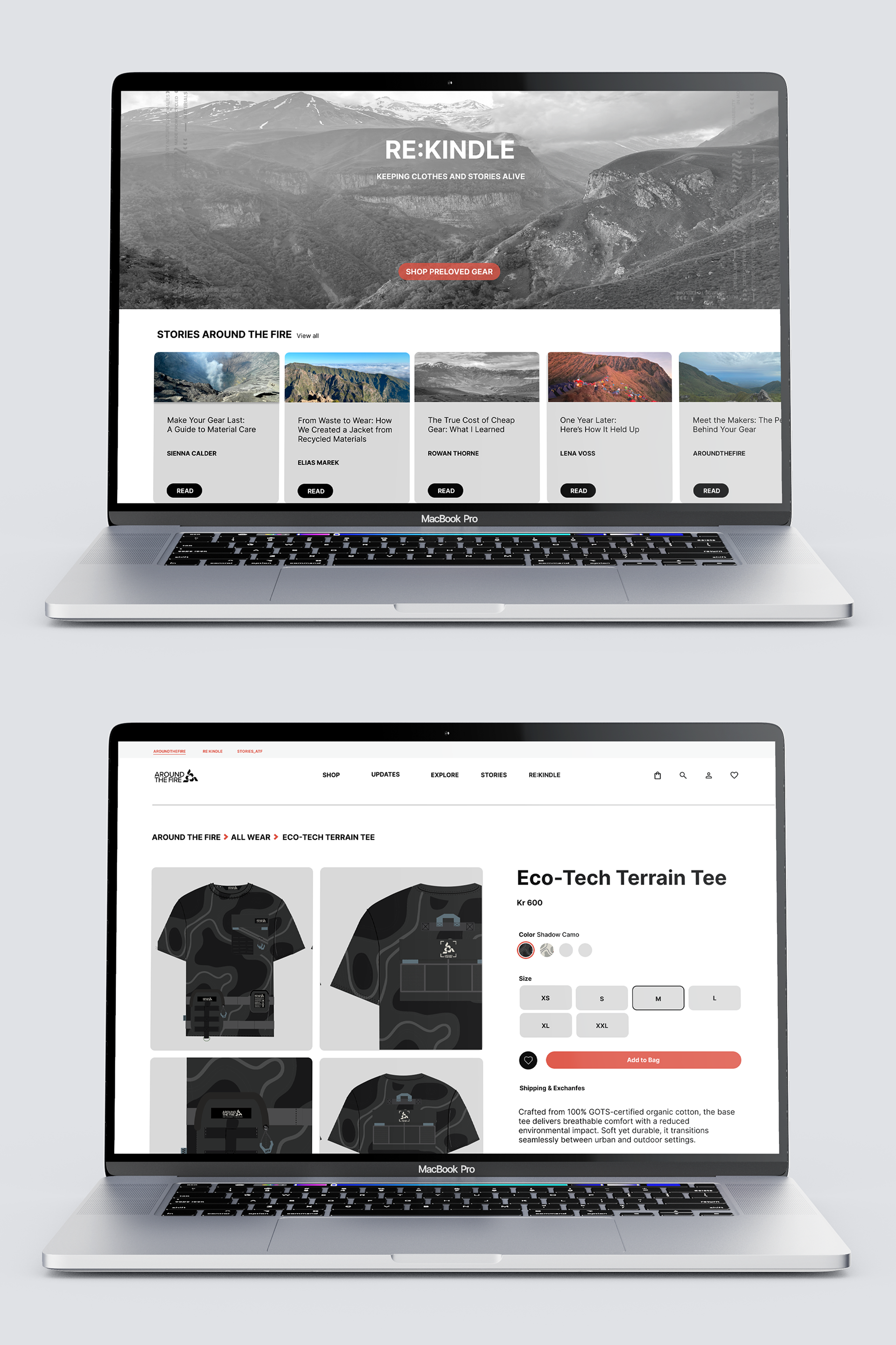
At the core of the project is Stories Around the Fire — a digital storytelling and community platform that invites users and the brand to co-create meaning by sharing personal stories connected to the garments and the outdoors. This shared narrative approach reinforces social norms around sustainable consumption and builds a sense of belonging and emotional connection.
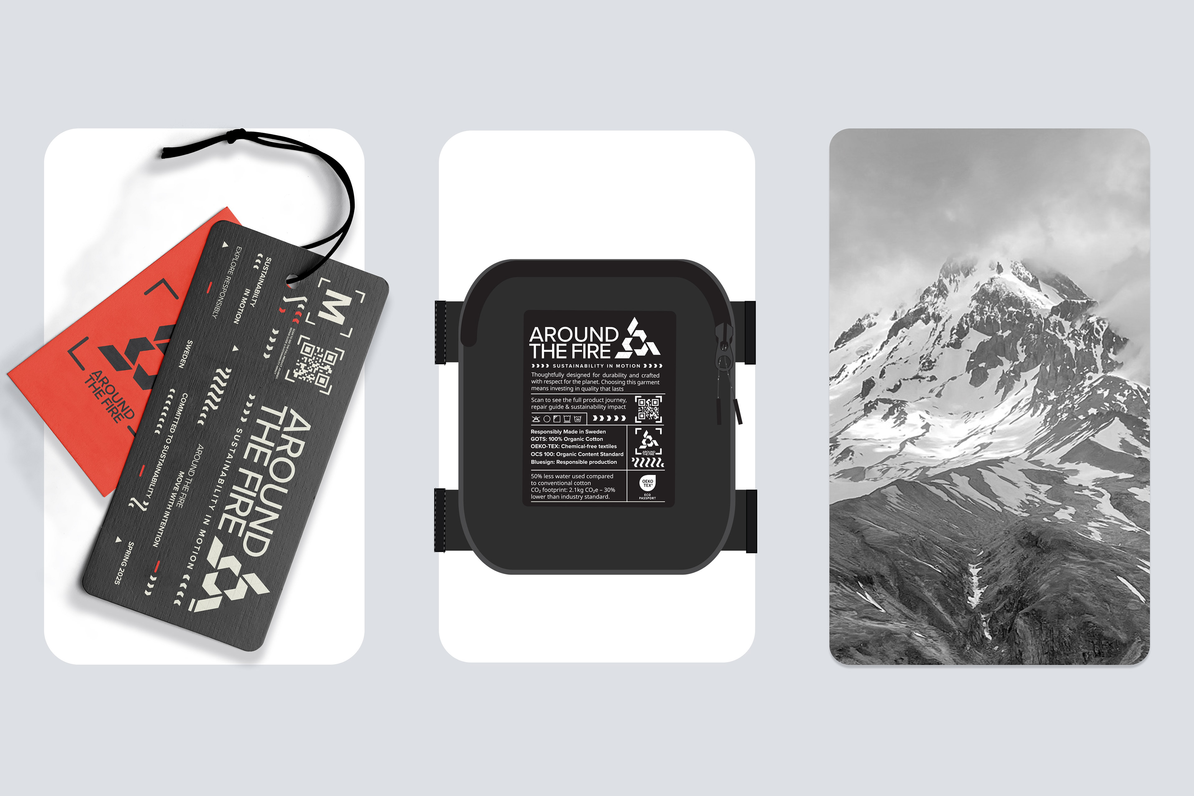
Transparency is integrated throughout — from material choices and digital product passports to certifications and sustainability icons — enhancing consumer trust and perceived control. The repair and resale service Re:kindle further extends product lifespan, encouraging circular behavior and long-term engagement.
Verbal identity plays an equally important role. With a tone that is raw, reflective, and empowering, the brand speaks to a new generation of conscious consumers — inviting them to question norms, embrace discomfort, and participate in shaping the story. The manifesto captures this ethos: “Maybe meaning isn’t something we find but something we create, through travel, creation, and shared experience.
Visual identity
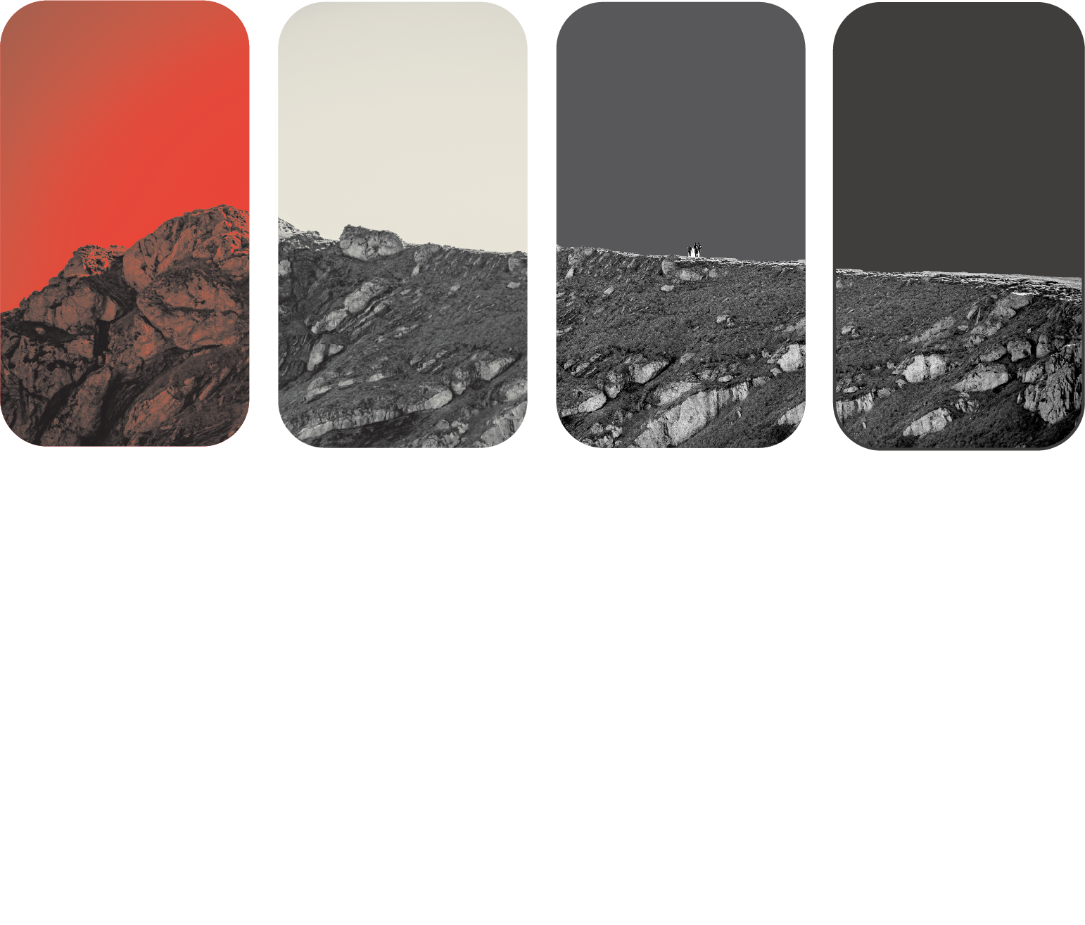
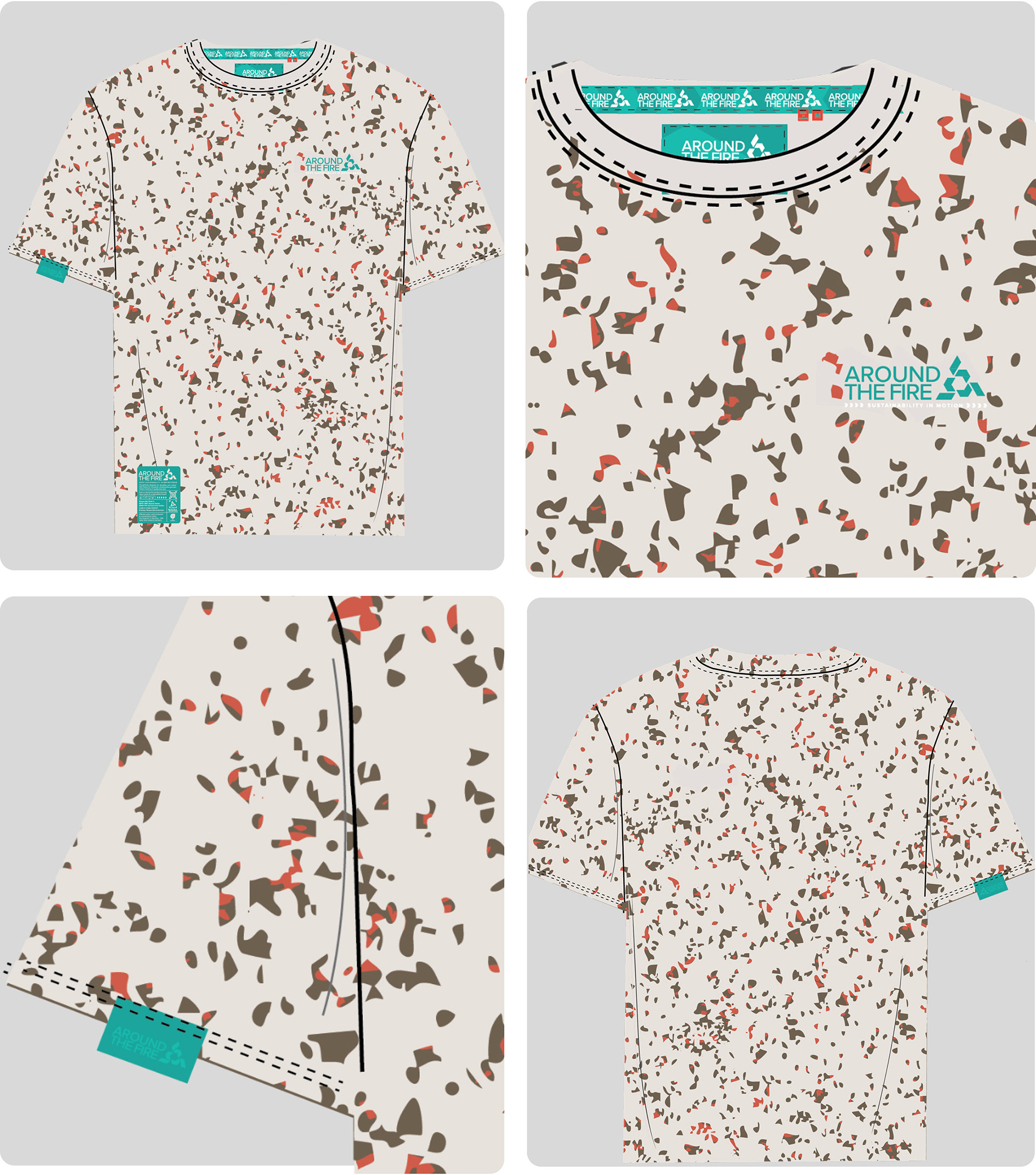
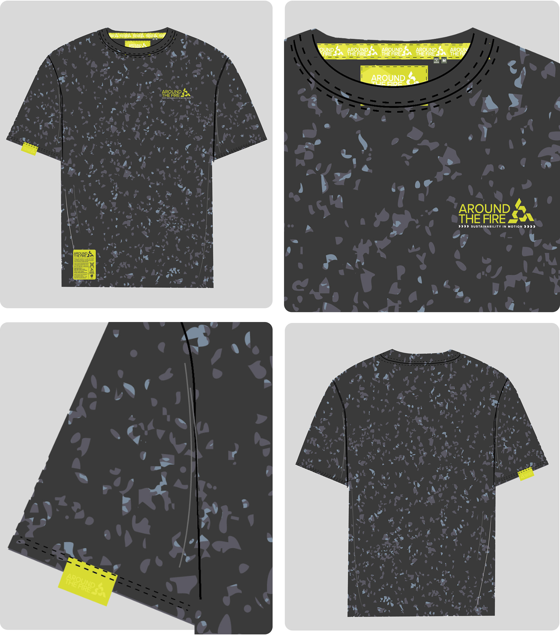
The visual identity draws inspiration from techwear and outdoor aesthetics, combining earthy tones, functional accents, and rugged textures establishing a strong connection to nature while maintaining an urban edge. Custom graphic elements, topographic lines, patch structures, and subtle distressing to reflect a sense of adventure, while remaining rooted in utility and purpose.
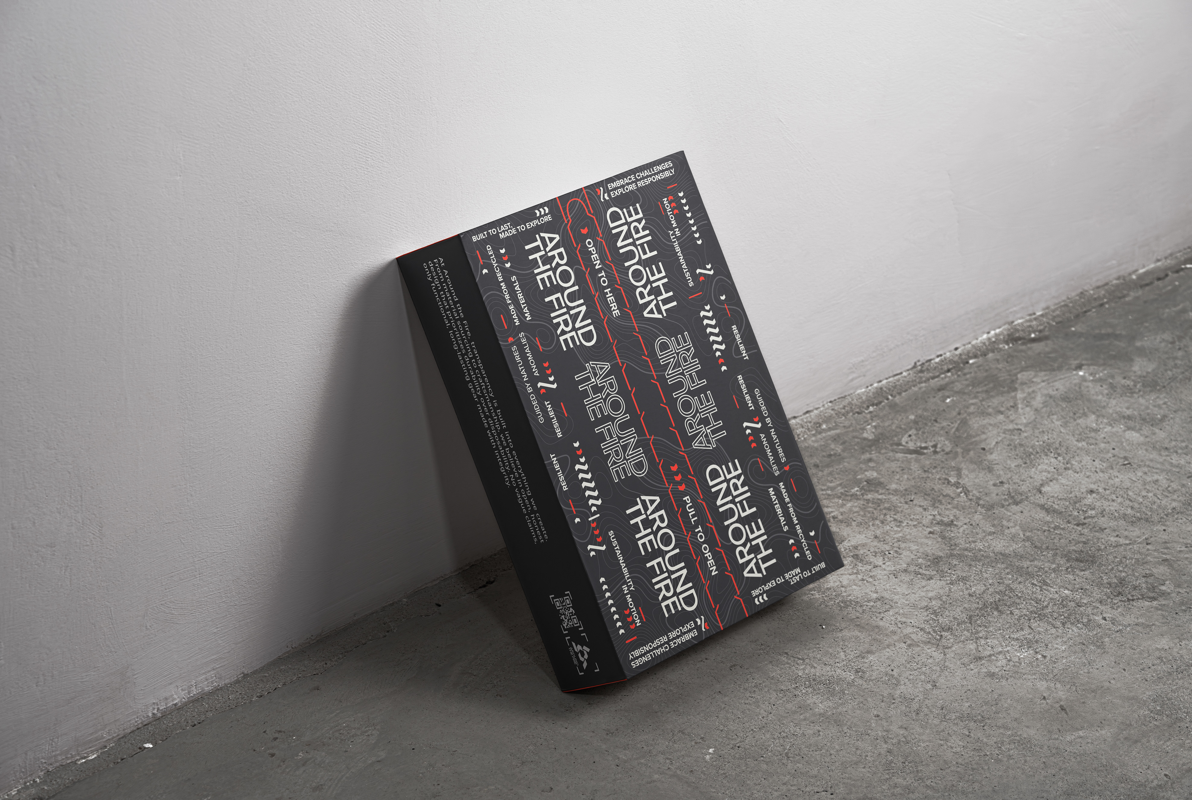


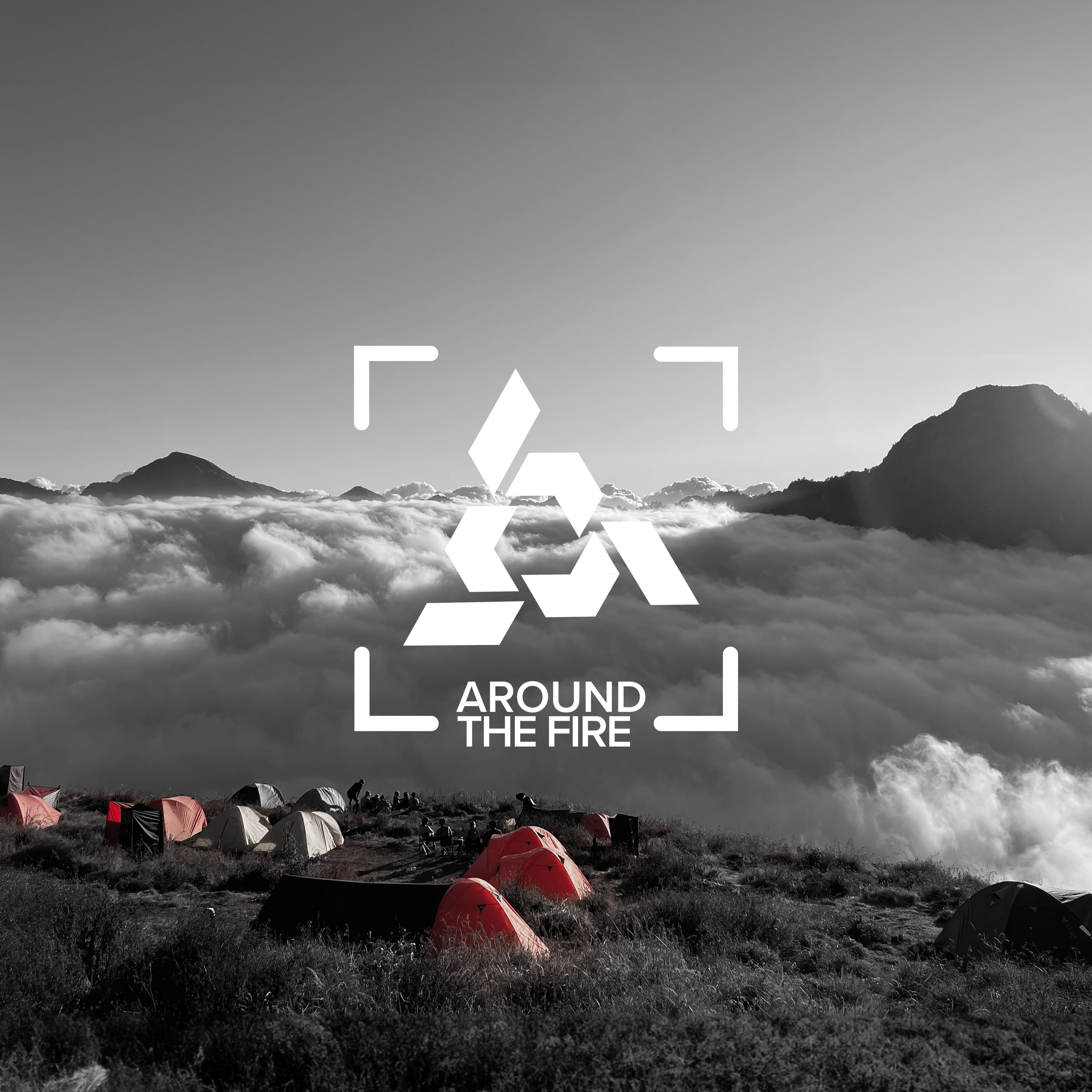
Logo
The logo, minimalist yet bold, features abstract flame shapes and modular forms that reference movement, growth, and adaptability.
The Products — Built for the Journey
Around the Fire designs functional, modular garments rooted in sustainability and inspired by both nature and urban exploration. Using recycled and durable locally sourced materials, each piece is made to last, adapt, and move with you.
Each product is built to be repaired, adapted, and reconfigured. Around the Fire challenges the throwaway mindset. Every detail supports durability, usability, and emotional connection. This is slow fashion designed for movement, meaning, and the unexplored.

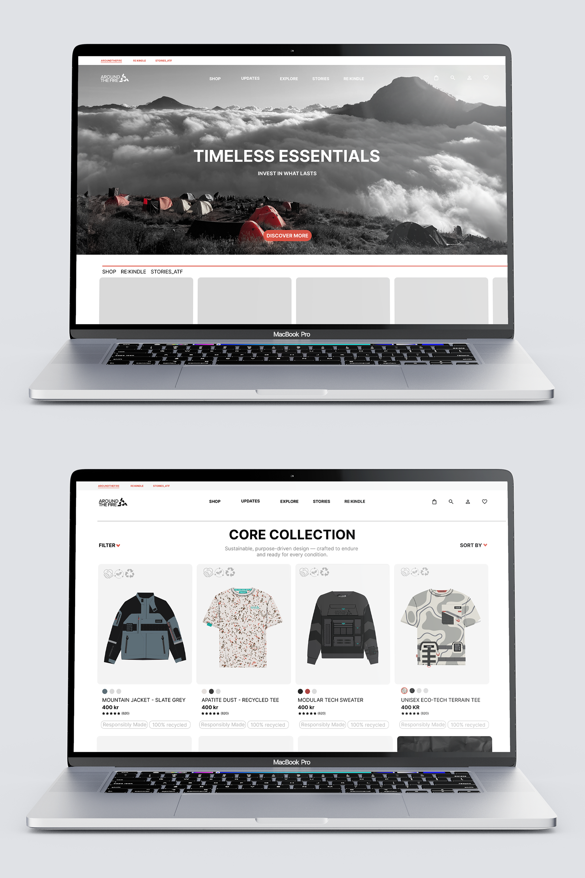
Website prototype
A user-friendly website that seamlessly combines branding, storytelling, and e-commerce. With a minimalist layout, intuitive navigation, and strong visual storytelling, the digital experience is designed to guide users toward sustainable choices. Inspired by nudging and choice architecture principles, the site encourages conscious consumption in an accessible and inspiring way.
The design highlights key brand pillars such as sustainable materials, transparency, and circular services like Re:kindle. Built in Figma, the interface features a dark theme with orange accents and clean, modern Inter typography, reinforcing the brand’s connection to techwear aesthetics and outdoor culture.